Anthropic has updated its Claude AI chatbot to generate charts, diagrams, and other visualizations directly within chat conversations. The feature is available to all users and is turned on by default.
Unlike Claude’s existing “artifacts” feature, which opens created content in a side panel for sharing or downloading, the new visualizations appear inline in the conversation. They are temporary and will change or disappear as the conversation continues. Users can ask Claude to adjust them or explore a topic further.
Claude decides on its own when a visual would be helpful, but users can also request one directly with phrases like “draw this as a diagram” or “visualize how this might change over time.” Anthropic gave two examples of the feature in action: an interactive periodic table that users can click through for more details, and a curve illustrating how compound interest works.
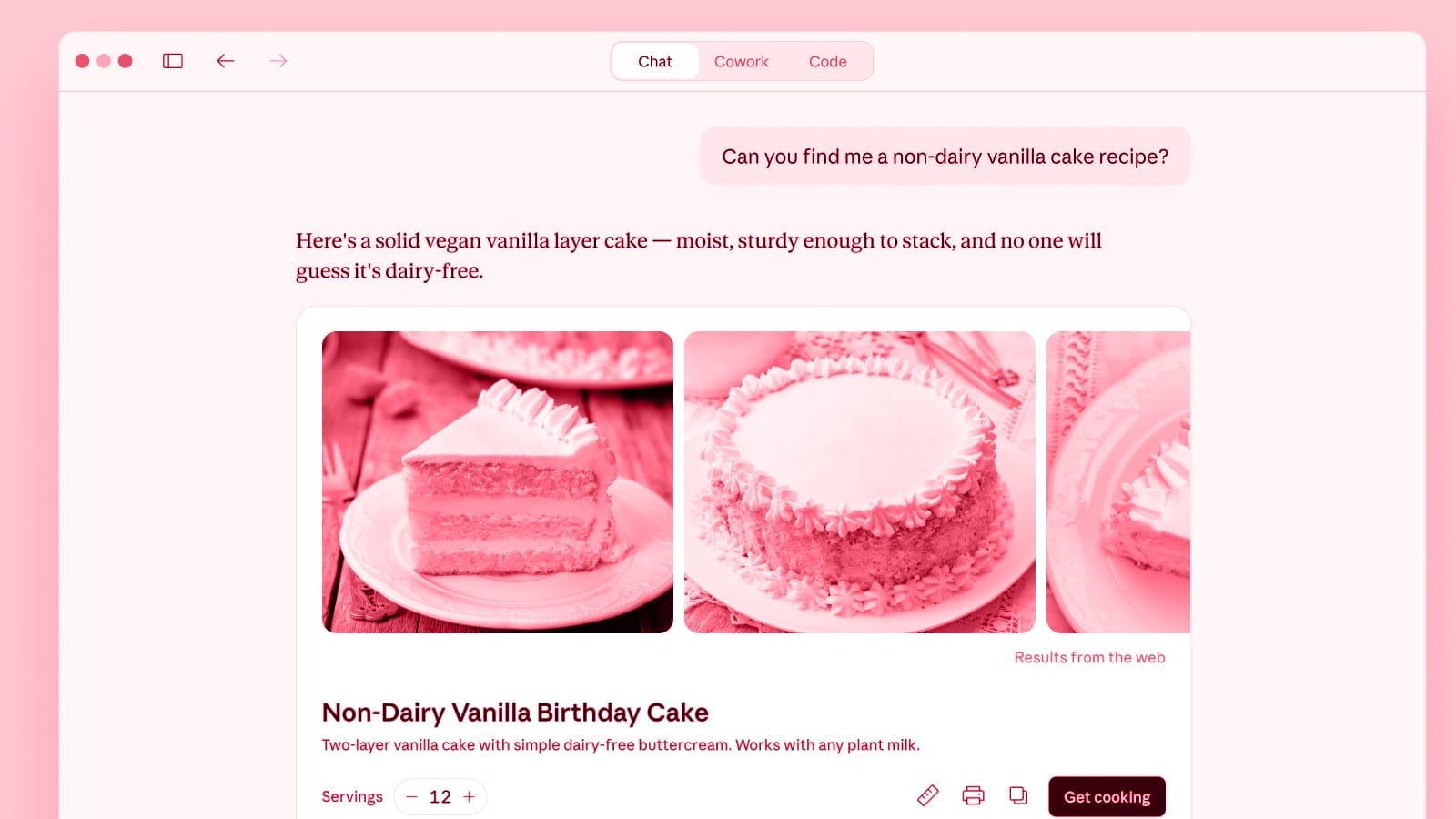
The new visualizations are part of a broader set of changes to how Claude formats its responses. These include purpose-built layouts for recipes and weather information, as well as the ability to interact with third-party apps like Figma, Canva, and Slack within a conversation.
Competing AI services offer similar features. OpenAI’s ChatGPT and Google Gemini both have tools that generate interactive visuals for educational topics.
Sources: Claude Blog, The Verge
Stay up to date
AI for content creation: the latest tools, tips and trends. Every two weeks in your inbox:

